Brand Guidelines — Internal Use
AZURE
Brand Guide
Everything the team needs to maintain a consistent, editorial luxury brand across every touchpoint.
AZURE · Los Cabos, Baja California Sur, Mexico · July 2026
Brand Essence
Curated Yacht Charters,
Perfected
AZURE is a luxury yacht charter company based in Los Cabos, Mexico. We are not a booking desk — we are a concierge. Our brand exists at the intersection of editorial elegance and operational excellence. Every interaction should feel like turning the page of a beautifully designed travel publication.
Mission
To deliver the most curated, seamless yacht experiences in Los Cabos — every charter, every guest, every time.
Position
Premium. Independent. Editorial. Not a broker — a hospitality brand for the sea.
Promise
One point of contact. Every detail handled. An experience that begins before the guest steps aboard.
Logo System
The AZURE
Mark
Primary Lockup
Full lockup — used on letterhead, proposals, and formal documents.
Monogram
Monogram — used as favicon, app icon, and collapsed navigation logo.
Wordmark Only
Wordmark — used at the top of the homepage and in navigation.
✓ Do
- • Use the navy (#0B2341) on light backgrounds
- • Use white on dark/photographic backgrounds
- • Maintain clear space equal to the circle's radius
- • Scale proportionally — never distort
✕ Don't
- • Don't change the logo colors
- • Don't add shadows, gradients, or effects
- • Don't rotate or skew the logo
- • Don't place on busy backgrounds without contrast
Color Palette
Navy, Linen,
& Sand
The AZURE palette is intentionally restrained. Deep navy anchors the brand, linen provides the canvas, and sand adds warmth. No bright colors, no gradients — just three disciplined tones and their neutrals.
Deep Navy
HSL: 215 70% 12% · Token: --deep-navy
Primary brand color, headings, logo, buttons
Linen
HSL: 40 33% 97% · Token: --linen
Page background, light surfaces
Sand
HSL: 35 25% 78% · Token: --sand
Accents, dividers, secondary elements
Stone
HSL: 35 12% 88% · Token: --stone
Muted backgrounds, cards
Charcoal
HSL: 0 0% 10% · Token: --charcoal
Body text, foreground
Muted Gray
HSL: 0 0% 40% · Token: --muted-foreground
Secondary text, captions
Typography
Cormorant Garamond
& Inter
Two fonts. One voice. Cormorant Garamond carries the editorial elegance — every heading, every title, every moment of emotion. Inter handles the practical — body text, labels, navigation. Nothing else.
Display & Headings
Aa
Cormorant Garamond
Weights: 300 Light · 400 Regular · 500 Medium · 600 SemiBold · 700 Bold
Available in regular and italic styles
Body & Labels
Aa
Inter
Weights: 300 Light · 400 Regular · 500 Medium · 600 SemiBold
Sans-serif · clean · highly legible
Type Scale
Display / Hero
Cormorant Garamond · Light (300)
Sample
Perfected
text-6xl – text-[10rem]
Hero headlines, page titles
Heading
Cormorant Garamond · Regular–Medium (400–500)
Sample
Curated Experiences
text-xl – text-5xl
Section titles, card headings
Body
Inter · Regular (400)
Sample
Every charter is built around the guest's vision.
text-sm – text-base
Paragraphs, descriptions, body copy
Label / Caption
Inter · Medium (500)
Sample
LOS CABOS, MEXICO
text-[0.55rem] – text-xs
Eyebrows, nav links, buttons, badges
Imagery & Layout
Editorial,
Not Decorative
Photography is the emotional engine of the brand. Every image should feel like it belongs in a travel magazine — natural light, expansive horizons, and a sense of calm luxury.
Imagery Guidelines
- —Full-bleed hero images and video are the signature — always high resolution.
- —Image treatment: object-cover with subtle scale on hover (transition 0.8s).
- —Overlays: gradient from black/70 (bottom) to black/20 (top) for text legibility.
- —Aspect ratios: 4/3 for cards, full viewport for heroes, 16/9 for video.
- —Stock photography only from Unsplash — never use watermarked images.
- —No heavy filters or oversaturation — natural, editorial, sun-drenched tones.
Spacing & Layout
- —Generous whitespace is non-negotiable — luxury breathes.
- —Section padding: py-20 lg:py-28 minimum between major blocks.
- —Container width: max-w-4xl for editorial content, max-w-7xl for galleries.
- —Letter-spacing on labels: tracking-[0.15em] – tracking-[0.3em] uppercase.
- —Use thin 1px dividers (hsl(var(--sand))) to separate, never thick borders.
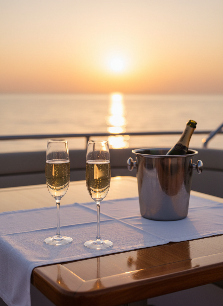
Reference Image
Sun-drenched, natural, editorial
Voice & Tone
Write Like
an Editor
The AZURE voice is editorial, confident, and warm. We write the way a travel magazine writes — present tense, sensory details, and an unwavering focus on the guest's experience.
✓ Do
Write in third person editorial voice
Lead with sensory, evocative language
Keep copy concise — one idea per paragraph
Use italic serif for emphasis words
Reference Los Cabos and the Sea of Cortez
Frame everything around the guest experience
✕ Don't
Use first person 'we' or 'I'
Use generic marketing buzzwords
Write dense blocks of text
Use bold for emphasis
Use generic 'Mexico' references
Talk about the company or fleet size
✓ Example Copy
"Watch the legendary Los Cabos sunset paint the sky in amber and rose. Enjoy premium cocktails, gourmet canapés, and panoramic views of Land's End as the day gives way to a canopy of stars."
✕ Not Like This
"We offer the best sunset cruises in Cabo! Book now for an amazing experience with great drinks and awesome views. Don't miss out on this incredible deal!"
Developer Reference
Tailwind
Class Library
Standard class strings for the most common UI patterns. Copy these directly to maintain consistency across pages.
Hero Heading
className="font-display text-6xl md:text-8xl lg:text-[10rem] font-light text-white leading-none tracking-tight"Eyebrow Label
className="text-[0.6rem] tracking-[0.3em] uppercase text-muted-foreground"Primary Button
className="text-[0.7rem] tracking-[0.25em] uppercase font-medium px-10 py-4 bg-primary text-primary-foreground"Section Title
className="font-display text-4xl md:text-5xl font-light tracking-tight"Editorial Image
className="w-full h-full object-cover transition-transform duration-700 hover:scale-105"Quick Reference
The AZURE
Standard
Fonts
Cormorant Garamond (display/headings) + Inter (body/labels)
Colors
Navy #0B2341 · Linen #F7F5F0 · Sand #C4B998
Voice
Editorial. Present tense. Sensory. Guest-first.
Imagery
Full-bleed. Natural light. Unstyled. Magazine quality.
When in doubt, ask: "Does this look like it belongs in a beautifully designed travel publication?" If the answer is yes, you're on brand. If not, simplify, remove, and let the content breathe.
AZURE · Brand Guidelines · Confidential — Internal Use Only · July 2026
We use cookies to improve your experience on our site. By clicking "Accept," you agree to our use of cookies as described in our Privacy Policy.